


Posted By

CSS and styling
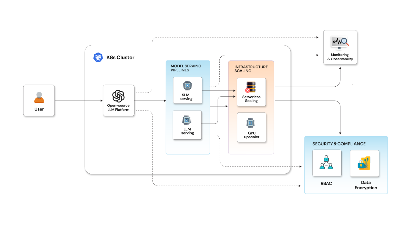
Imagine your website without CSS. Okay, let me simplify this for you. Imagine a skinless human body. Yeah, just the skeleton. Still not getting it? Okay, the image below will help you understand what I’m trying to say here-
As difficult as it is for you to think of a skinless body, it is equally difficult for UI developers to think of a UI without CSS. CSS is a language that defines the way your web pages look. With CSS, web designers can add custom fonts, colors, layouts, and unique designs to web pages. Although the styling part is fairly simple, one needs to focus on all the aspects of CSS like the newly upgraded frameworks that are used for styling and managing web applications. Bootstrap, Semantic UI, and Material UI are some of the leading names. However, the real struggle starts when one has to apply conditional or generic CSS to many components. And thus, the idea of variables and mixins came into existence. But as a React JS developer, I rely more on the styled components that are rarely used due to the lack of awareness.
Styled Components - a brief
Styled Components were introduced by the React community and were meant to be successors to CSS Modules. Modules enable you to write CSS that’s scoped to a single component and not leak to any other element on the page. Whereas, Styled Component is a kind of CSS in JS solution, which means you don’t have external CSS files to fiddle with. Everything is in one place — logic, styling, and markup. Initially, this might feel a bit confusing but believe me, it is very useful. Styled Components help in tracking the components that are rendered on a page and inject their styles, all this in a fully automated way. And you can combine Styled Components with code splitting to bring down load times for your users.
Installing Styled Components
npm install --save styled-components
Fire this command, and your Styled Components are ready.
How to use Styled Components
import React from 'react';
import styled from 'styled-components';
const StyledButton = styled.button`
border-radius: 5px;
color: #fff;
padding: 10px 15px;
outline: none;
border: none;
cursor: pointer;
margin: 15px;`
const Application = () => {return (<div>
<StyledButton>Click me</StyledButton>
<StyledButton>Click for secondary Action</StyledButton>
</div>
)}
At this point, a style button should be declared as a component throughout the application.
The main advantages of using this kind of notation are -
- Freedom to build custom components with style
- Maintaining uniform styling throughout the page
- Provision to style any HTML component
- Dodges inline styling
- Scope based styling.
Dynamic Styling
const StyledButton = styled.button`
background: ${props => (props.primary ? 'black' : 'white')};
color: ${props => (props.primary ? 'white' : 'black')};
render(<div>
<StyledButton>A normal button</StyledButton>
<StyledButton primary>The primary button</StyledButton>
</div>
To conditionally render the style, in the above code, you are passing prop ‘primary’ to Styled Component. Once you pass any prop to a Styled Component, it will pass it down to the mounted DOM node. You can reuse the same styled component by changing some of the CSS properties as per the requirement. You can pass any flag, prop, or state to change the style as and when required.
You can use the following syntax to change the style according to the requirement -
<Button className={`btn ${this.props.primary ? 'btn--primary' : 'btn--info' }'}>
With the Styled Components, you can easily have components with different conditional styles, and there is no need to write two different classes in the CSS file.
Inheriting Styled Components
Can Styled Components inherit from each other? The answer is ‘YES’. A Styled Component can reuse the styles present in another styled component. Let's say you have a styled div and you have declared a Styled Component for the same. As per the requirement, you only have to change one CSS property for another div. Instead of declaring a new class in the CSS file, you can have a new div style inherited for the already declared Styled Component.
For example:
- StyledDiv having conditional CSS properties.
- StyledDivYellow needs to have the same CSS properties but different background color.
const StyledDiv = styled.div`
width: 50%;
border: 2px solid black;
${props => (props.color === 'blue') ? `background-color: blue`: null}
${props => (props.color === 'red' ? `background-color: red`: null)}`;
const StyledDivYellow = styled(StyledDiv)`
Background-color : ‘yellow’;
Creating Global Styles
Styled-components are primarily used for a single CSS class that is isolated from other components. Styled Components come in handy when you want to override global styling. You can use a helper function to generate a special Styled Component that handles global styles, i.e., “createGlobalStyle”. Place it at the top of your React tree, and the global styles will be injected when the component is "rendered"
import { createGlobalStyle } from 'styled-components'
const GlobalStyle = createGlobalStyle`body {
color: ${props => (props.whiteColor ? 'white' : 'black')};}`// later in your app
<React.Fragment>
<GlobalStyle whiteColor>
</React.Fragment>
Adding Media Query and Nesting
Nowadays, Bootstrap is a more trusted framework in CSS which is widely used for the responsiveness of the web application. Although Bootstrap is a superior solution, one may also write media queries at some places to make web applications more responsive. Here is an example to write a media query for a particular component/HTML tag and declare it as a Styled Component.
const StyledCard = styled.div`max-width: 350px;
border: 1px solid rgba(0, 0, 0, 0.1);
border-radius: 5px;	overflow: hidden;
box-shadow: 5px 5px 10px rgba(0, 0, 0, 0.3);
margin: 30px auto;
@media (max-width: 1000px) {
background-color: red;    }`;
const Card = () => (  <StyledCard>    {/* Content goes here */}  </StyledCard>);
Styling is an important aspect of any application because it influences the brand identity. It is one of the vital building blocks of the product UI and defines the user-feels about the product/service. There are more things that you can do with Styled Components. I will try to come up with more articles around the Styled components but for now, that’s it from my side. Happy Coding :)