


Posted By

Every developer wants to ensure the best performance for the application that is being built. Most of us concentrate more on technicalities when it comes to the performance of the application. Of course, that is the most important part of any application. But you often ignore a part of the performance called perceived performance. Perceived performance is nothing but how fast an action appears to happen to the user. Showing an abstract widget or using boring loading spinners in your user interface can kill your application’s experience. With these random and abstract loaders, a user doesn’t really get an idea as to what is going to appear on the screen. The following image will help you understand the whole point in a better way:
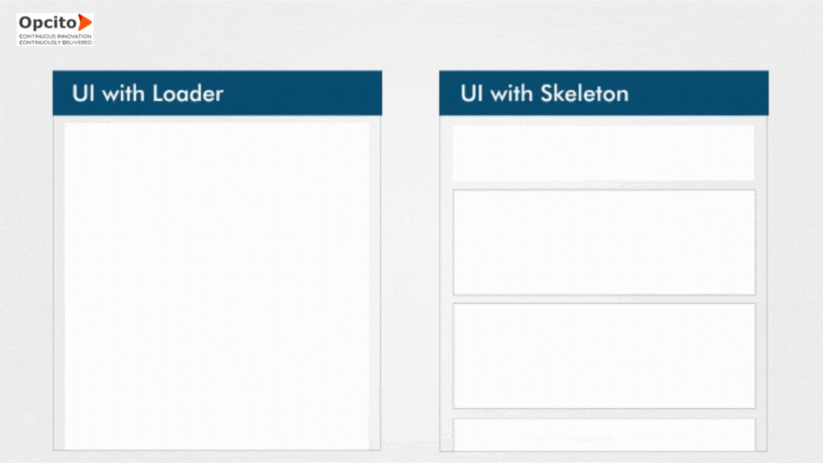
What will you, as a user, prefer? I am sure the Skeleton UI was more engaging than the loader one. With Skeleton screens, you can create an engaging experience with the anticipation of what output is to come on the screen. This will help users to get an idea of what they can expect and what the application will look like.
This blog will give you an idea of how you can create a Skeleton component and use that inside your web-application. This Skeleton is rendered whenever the contents are unavailable.
So, let’s start with the actual Skeleton component creation:
export default class Skeleton extends Component {
/**
 * This function provides the preloaders for the skeleton.
 * Default there are 3 preLoaders.
 */
 preLoader() {
   let preloaders = [];

  // Creating background gradient.
   let elementStyle = {
     'background': 'linear-gradient(to right, '+ this.props.color +', #f7f7f7)'
   };
  // Generating pre-loaders
   for (let index = 0; index < 3; index++) {
     preloaders.push(<div key={index} className="element" style={elementStyle}></div>)
   }
   return preloaders;
 }
/**
 * This function provides loader rows, default is 1.
 * User can provide the number of rows from props.
 */
loaderRows() {
   const rows = [];
   for (let index = 0; index < this.props.count; index++) {
     rows.push(
       <div key={index} className="skeleton">
         {this.preLoader()}
       </div>
     );
   }
   return rows;
 }

 render() {
   return (
     <div>{this.loaderRows()}</div>
   );
 }
}
The Skeleton component allows users to customize colors and provides a count for the rows to be shown.
You can define PropTypes and set their default values for the component in the following manner:
static propTypes = {
   color: PropTypes.string,
   count: PropTypes.number
}

static defaultProps = {
   count: 1,
   color: '#f4f4f4'
 }
The complete component will look like this:
import React, { Component } from "react";
import PropTypes from 'prop-types';

export default class Skeleton extends Component {
    preLoader() {
        let preloaders = [];
        let elementStyle = {
            'background': 'linear-gradient(to right, '+ this.props.color +', #f7f7f7)'
        };
        for (let index = 0; index < 3; index++) {
            preloaders.push(<div key={index} className="element" style={elementStyle}></div>)
        }
        return preloaders;
    }

    loaderRows() {
        const rows = [];
        for (let index = 0; index < this.props.count; index++) {
            rows.push(
                <div key={index} className="skeleton">
                    {this.preLoader()}
                </div>
            );
        }
        return rows;
    }

    render() {
        return (
            <div>{this.loaderRows()}</div>
        );
    }

    static propTypes = {
        color: PropTypes.string,
        count: PropTypes.number
    }

    static defaultProps = {
        count: 1,
        color: '#f4f4f4'
    }
}
Using SCSS, we can draw the basic shapes that will make up the card Skeleton. We can do this by adding proper width, background, or color property. Unanimated Skeleton screens don’t inform the user much about the loading process. The user might keep on wondering if the page is loading or is it a broken one? To save users from this, you can make it better by animating the Skeleton using a pulsing animation with the help of SCSS, as shown in below code snippet:
.skeleton {
padding-bottom: 20px;
border-bottom: 1px solid #dddddd;
padding-top: 10px;
opacity: 0.5;
@keyframes animate-row{
0%{
background-position: -500px 0;
opacity: 0;
}
100%{
background-position: 0 0;
opacity: 1;
}
}
.element {
height: 1em;
margin-top: 10px;
position: relative;
animation: animate-row 1100ms linear infinite;
&amp;:after {
position: absolute;
display: block;
content: '';
right: 0;
bottom: 0;
top: 0;
background-color: white;
}
$elements: 3;
@for $i from 0 to $elements {
&amp;:nth-child(#{$i + 1}):after {
width: calc(#{10% * ($i+1)});
}
}
}
}
Usage of the component:
To use the Skeleton component, you will need to create a state object that is initially set to true. The Skeleton will be displayed as long as the condition is true and the content will be rendered.
constructor(props) {
   super(props);
     this.state = {
       visible:true
     }
 }

{this.state.visible ?
   <Skeleton count={3} color="#bbb" />:
   <h2>Component to show after content loaded</h2>}
Component to show after content loaded
}
The next step is to create a function that will set the state of visible false once the page is loaded. As soon as the content is rendered and ready, the state will be changed to false, and the Skeleton component will not be visible; instead, the content will be displayed using the following function:
 togglePageLoad() {
   this.setState({ visible: false })
 }
 componentWillMount(){
    this.togglePageLoad();
 }
Now it’s time to combine everything together inside the main application:
import React, {Component} from 'react';
import Skeleton from './Skeleton';
import './Skeleton.css';

class Demo extends Component {
  constructor(props) {
   super(props);
     this.state = {
       visible:true
     }
 }
  togglePageLoad() {
   this.setState({ visible: false })
 }
 componentWillMount(){
    this.togglePageLoad();
 }
   render() {
   return (
     <div id="demo">
       <h1> React Skeleton Demo </h1>
       {this.state.visible ?
       <Skeleton count={3} color="#bbb" />:
       <h2>Content Loaded</h2>
    }
     </div>
   );
 }
}
export default Demo;
That’s it! Now your user will have a completely different interface where he will be able to scroll and interact with the application while the content is still being loaded. This will not only help the user to get an idea of what to expect when the content is loaded completely, but also it will help you reduce the user bounce ratio for the application.